How to enhance colours in photographs with Photoshop
Today, we will discuss the art of enhancing colors in a photograph, specifically focusing on increasing saturation or vibrancy while preserving the existing color palette.
This is a topic where different photographers may employ various techniques, resulting in diverse approaches. Personally, I rely on two preferred methods for enhancing colors in an existing photo, both of which are accomplished using Photoshop techniques.
Channel Mixer
The Channel Mixer method offers a quick and convenient way to achieve color enhancement, although it may not match the quality of the "LAB method." This technique is often likened to the famed Fuji Velvia transparency film for its highly saturated look.
One key advantage of this method is that it is non-destructive, meaning it won't alter or damage any pixels in your image. It utilizes an adjustment layer, specifically a channel mixer adjustment layer.
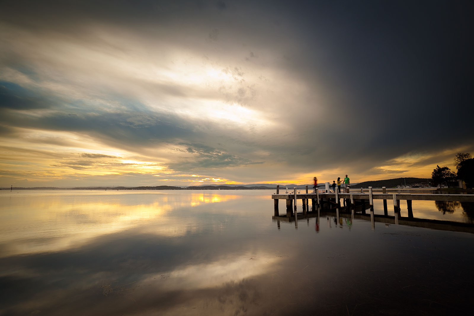
For reference, here's what our test image looks like before any adjustments:
The channel mixer allows you to adjust the source contributions from the red, blue, and green channels for each of the output channels. Typically, you can make adjustments as follows:
- Red Output Channel: R=150%, G=-25%, B=-25%
- Green Output Channel: R=-25%, G=150%, B=-25%
- Blue Output Channel: R=-25%, G=-25%, B=150%
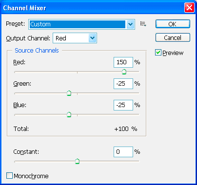
It's important to note that the sum of the three source channels always adds up to 100% for each output channel.
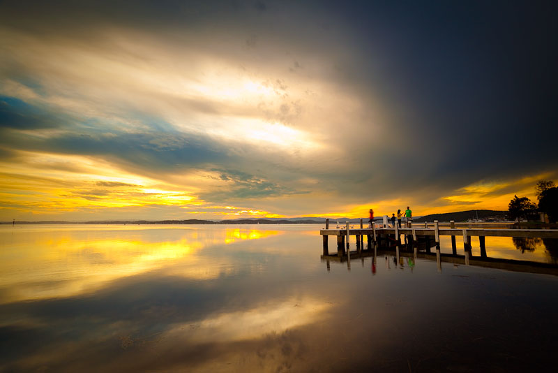
After applying these adjustment layers, you'll notice that the colors in the photo become significantly more saturated, often surpassing the capabilities of a simple saturation tool.
To control the strength of the effect, you can adjust the opacity of the adjustment layer.
LAB Mode A and B Channel Curves Adjustment
This method tends to produce more pleasing results but is less convenient than the Channel Mixer. It involves adjusting the A and B curves while working in LAB color, which differs from the more common RGB color space.
A drawback of this method is its destructive nature; it cannot be applied as an adjustment layer. To work in LAB mode, you often need to flatten your layers, although in some cases, it may not be necessary. Keep in mind that converting between RGB and LAB and back again can result in a loss of detail, but working in 16-bit mode can help minimize such losses.
I personally favor this method because it adjusts color saturation without affecting overall luminosity. To begin, we need to convert our image to LAB mode, but since we have multiple layers, we should create a duplicate to avoid flattening.
- Duplicate the image using Image -> Duplicate...
- Edit -> Mode -> LAB Color
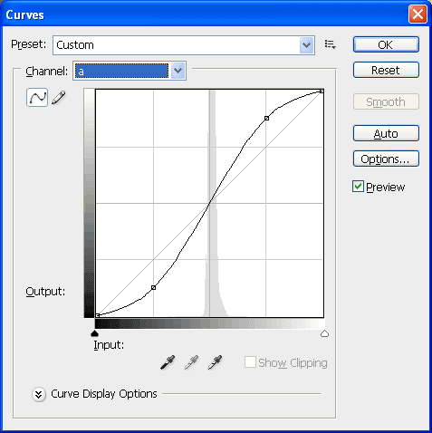
Now, you're in LAB mode, where you'll work with L, a, and b channels instead of red, green, and blue. Add a curves adjustment layer and make changes to the a and b channels. These channels represent color information, ranging from -128 to +128, with higher values indicating greater color saturation.
Apply an S-curve with the following control points (input, output):
- 0,0 (this should already be there)
- -64,-96
- +64,+96
- 128,128 (this should already be there)
The curves adjustment dialog should resemble this (the screenshot shows the adjustment curve already set up):
Ensure the curve is symmetrical to avoid color shifts. The numbers I've provided are guidelines, but any symmetrical S-curve will work, with a stronger S-curve producing a more pronounced saturation effect.
By adjusting the opacity of the curves adjustment layer, you can control the strength of the effect on your image. After completing your adjustments, you can flatten the layers and copy the result back into the original file as a new layer.
Automating with Actions
If you find these two methods effective, consider recording an action. This eliminates the need to set parameters repeatedly, streamlining your workflow.
A Note About Lightroom
Adobe Photoshop Lightroom offers a quick edit method called Vibrancy, which works well for non-critical images. Don't overlook this option!
Avoiding Oversaturation and Clipping
When enhancing colors in an image, it's easy to go overboard. Keep these considerations in mind:
- You may create colors in your image that cannot be reproduced in print.
- There may be colors in your image that don't exist on certain monitors or vice versa.
Managing color in these scenarios is a topic in itself. However, for those familiar with color management, you can:
- Use the Gamut Warning option in Photoshop to identify clipped colors, selecting the correct ICC profile for your printer and paper combination.
- Utilize soft-proofing to approximate your print's appearance.
- Remember that what looks great on a computer monitor may not translate well to print, so make adjustments with your output device and profile in mind.
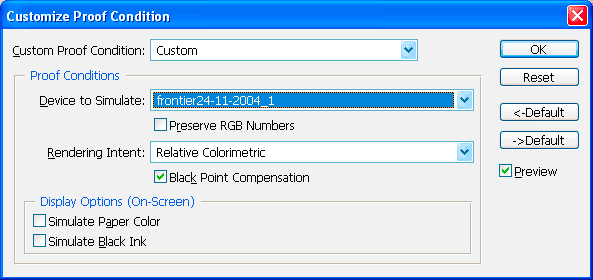
In the screenshot above, the grey areas indicate colors that have been clipped and are outside the gamut of a Fuji Frontier and lustre paper combination. You can reduce or mask out the adjustment in these areas using layer masks or by adjusting the opacity of the adjustment layer.
The example image may be extreme, but it demonstrates the importance of monitoring color saturation.
Localized Adjustments
You don't need to apply these adjustments to your entire image. If you prefer changes in specific areas, make use of layer masks, brushes, or gradients to target only the areas that require enhancement.
Other Techniques
While I personally don't use these methods, here are some alternative techniques you may want to explore:
- Increasing saturation under hue/saturation.
- Using vibrancy in Lightroom (a quick option if you're in a hurry and don't plan to use Photoshop).